Sunday 31 March 2013

My magazine evaluation

My Magazine Evaluation 

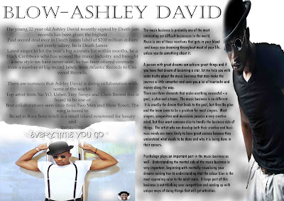
For my magazine i have used a BOLD font tinted in grey and a smoked background to make the title stand out and catch the audience attention this makes my magazine look very unusual, The title is overlapping the large portrait image of ashley david witch gives the magazine more of a striking  look because the grey title is overlapping a black background, for my magazine i have also used a wide range of colours from white, blue, green, grey, black and also red witch make it more appealing to a wider range of audience, my magazine has also advertised a large number of celebrity music artist that are well known world wide and will attract fans to buy my magazine.

After being given feed back on my magazine I changed the colours from black to Red to make the words stand out more and also catch the readers attention a lot more, i also turned the more important information into a different colour to catch the readers attention, after reading my feedback i decided to start from scratch on my double page spread because it was a bit bland and didn't impress my target audience.

Forbes has all been advertised on my magazine because they are the hosts of The Big Year's Winners witch is a very important even for the music industry because puts all the artist in ranks of best sellers of the year, Most profited artist, Lyricist of the year and other categories this will help attract all the Forbes press and fans to my magazine, This magazine is targeted at all types of music artist, fashion designers and all types of members of public that are into fashion and music.

My magazine is targeted at 15-45 year olds that are into the latest fashion, newest artist industry and also most popular music celebs that have famous history, this magazine has been created to appeal to all ages because i have used a wide range of ages of artist in magazine witch is appeal to older people.

While constructing my magazine i have learnt the ins and outs of photoshop and what can be done to give you the best finish in quality and extraordinary designs from using an existing font from something and adapting it to be even better, i am know able to edit images and fade them into layers to create the best effects possible and create texts and fonts that would attract a wide audience.
                                          

Saturday 30 March 2013

beginning of my research


Vibe Magazine
This is another content page created Vibe but on a different artist called Amber Rose i have chosen this content page because its main focus is on a different gender but still has the same mission to capture the audience attention witch it has done by putting all the information to one side but still in a eye-catching font, size and colour witch is very important for magazines like this, They have used a large portrait image of Amber Rose but slightly moved to one side to brake up the page but at the same time blend the writing information into the image, Amber Rose has been put under a spot like to show the audience her beautiful appearance witch attracts a wide range of audience from women, men and also runway models and modelling agencies that may may find her very appealing.
This image is a very powerful image because it will attract fans and publicity that know Amber Rose affiliations from Kanye-west to Wiz-Kalifa other famous artist that will draw a audience to the magazine.
The informations has been broken down into six different categories but they haven't been done like a normal magazine they have used Logos and different colours to stand out and catch the readers eye. 


Preparation for my Blow- magazine


Blow-
My music magazine will be called Blow- the reason i have called my magazine Blow- is because the the word blow mean in music terms means you have achieved the music dream you have blown your know apart of the successful music artist that have already blown for instance Jay-z, P-Diddy, Kanye-West act all known world wide artist that have achieved the music dream. 
My Magazine will be sold nationally but mainly targeted in the UK and USA the two places with the highest music population, my magazine will be sold for £2.99 in GB pounds and in exchange rate in all the other countries because i have found out from my survey results that most people would pay £2.99 or more for this type of magazine.

starting research for Content page

Usher Content Page 

This is one of the content pages that gave me my inspiration to design my Blow- Content page, this content page is very simple but effective they have used one large image to capture the audience attention witch has worked because my attention is straight away turned to the image of Usher, They have put all the information to one side of the page with a darker background to make the detailed information stand out even more this has created more of a split page fill but at the same time not over powered the image, This content page mainly consist of news about famous music artists for example Soulja Boy who is a young 21 year old tatted up rapper who has come clean for the first time about his most lethal shots fired, i have leant this from just a short brief written under one of the content titles witch i think is a good idea because it makes you want to read this magazine to know the full story and what really happened, The large image of usher has also created a large target audience of all ages and all reasons some people may wan to read the magazine because of the talented music he created and others because of his fashion.